My first .NET Component, a DateTimePicker that accepts no date
Introduction
I was updating existing programs at work and needed a DateTimePicker that allowed the user to leave blank or make blank (nullable). I searched for a control I liked and mostly found people placing a panel or button up against the DateTimePicker. I waned to use a DateTimePicker itself, so I made my own. I am fairly new to .NET, though I do have a background in Delphi where I have made components, so I thought it would be a good first start.
Using the code
This part is simple. Drop the files in your project and then do a build and the new component shows up on your component list. Now drag it to your form. The component will look like the DateTimePicker because inherits from it.
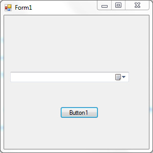
Here are simple images of it with just a button on the form...
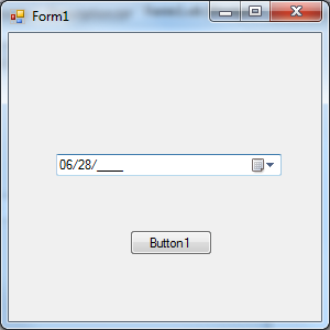
I am entering a date with the keyboard above.
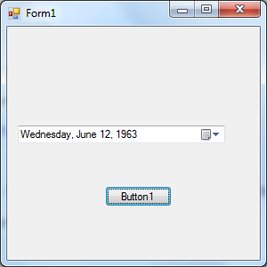
I finish entering the date and the button gets focus. Note that myDateTimePicker uses the format set in the DateTimePicker for the display. MM/DD/YYYY is only while in the control to enter the date. If you live in another country, you can change the masks used in the code.
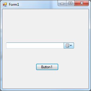
I go back to the component and hit Delete and clear the date and go back to button focus. Now my mouse hovers over the right side of the control (mouse does not show in MS snip tool I guess).
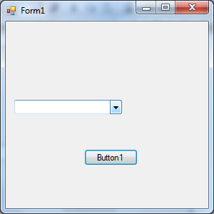
On the datetimepicker, if you make it too small for the date display, the calendar BMP goes away. Since my component is using the DateTimePicker, it acts the same. Here is the DTP with the calendar gone, leaving the arrow only and my mouse hovering over it.
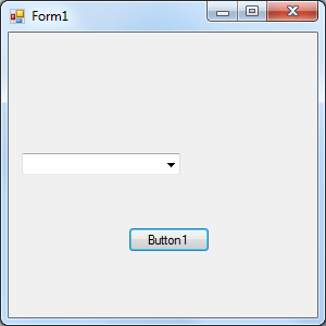
After I delete the date (nulled):
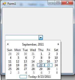
Now I click on the calendar popout:
I decide to hit Escape, so the calendar goes away and no date is accepted.
The code
I start with a class that inherits the DateTimePicker.
Imports System.ComponentModel

Partial Class MyDateTimePicker
    Inherits System.Windows.Forms.DateTimePicker
That gives me the DTP (DateTimePicker) as my base. Now I need to take over the control's display, but after reading about the class carefully and searching for other people's work, I decided that it was either not possible or not possible at my level of knowledge. So I decided to place a textbox over the component. This offered me a few new issues on the first attempt.
- The textbox would cover parts of the right bitmaps on the
DateTimePickereven if I used the client width of the DTP. - There is now way I could find to tell me the text display width in the DTP or where the bitmaps start.
- If the DTP is resized or the format changes, it really causes issues with the
TextBox.
I had to come up with some ways to deal with the issues listed. I decided to use a Panel placed in the DTP. I would size it and then put the TextBox in the Panel. So I added the Panel next.
Private pnl As Panel

Public Sub New() ' The DateTimePicker Consutructor
    MyBase.New()

    ' This call is required by the Component Designer.
    InitializeComponent()

    'Add any initialization after the InitializeComponent() call
    Value = Today

    pnl = New Panel
    With pnl
        pnl.Top = 1
        pnl.Left = 1
        pnl.Height = Me.ClientRectangle.Height
        pnl.Width = Me.ClientRectangle.Width - 34
        pnl.Anchor = CType(((System.Windows.Forms.AnchorStyles.Top Or _
            System.Windows.Forms.AnchorStyles.Bottom) Or _
            System.Windows.Forms.AnchorStyles.Left), _
            System.Windows.Forms.AnchorStyles)
        pnl.BackColor = System.Drawing.SystemColors.Window
        pnl.Name = "pnl"
        pnl.Margin = New System.Windows.Forms.Padding(0)
        pnl.Padding = New System.Windows.Forms.Padding(0)
    End With
    Me.Controls.Add(pnl)
I create the Panel in the DTP new constructor. I set the initial position to the upper left of the DTP plus 1 to account for the border of the DTP, and I cover the DTP display area less 34 pixels on the width. This setting is just the base and will change all the time so the panel will not cover the right side bitmaps on the DTP dropdown (more on that later). I then set the anchor points and add thee Panel to the DTP.
Now I needed a way to deal with setting the true panel size so it never covered the DTP images or the hover border on the right. This proved to be more difficult for me than I had hoped. First I used the Graphics class to render a copy of the DTP text using the same font and then checked the text width, but the DTP seems to space out oddly if it is a long format and the text widths were close but never right. So I abandoned that for a new idea. It seems the bitmaps used in the DTP do not resize no matter how large a font is used, so I could count on the fixed size (the -34 in the panel width). But if you make the DTP width too small, it drops the calendar bitmap and just leaves the arrow, so the size does change some. I needed a way to figure out if the arrow was alone or the calendar was there as well if I was going to figure the new panel width. I then realized that in VB.NET 2003 to 2010, the arrow is one of two colors depending on the existence of the calendar bitmap, so I decided to use that. I came up with a routine to make an image copy of the DTP and locate the arrow and test its color to decide on how wide the panel needed to be. This works well and leaves the natural DTP rollover highlights and box borders, so no one can tell the display is covered.
Private Function getCoverSize() As Integer
    Dim g As Graphics = Me.CreateGraphics()
    Dim bmp As New Bitmap(Me.Width, Me.Height)
    Me.DrawToBitmap(bmp, New Rectangle(0, 0, Me.Width, Me.Height))
    Dim cc As Color
    Dim y As Integer
    ' find the first blank column
    For x = bmp.Width - 3 To 0 Step -1
        y = bmp.Height - 2
        While y > 1
            cc = bmp.GetPixel(x, y)
            If (cc.A <> Color.White.A Or cc.R <> Color.White.R Or _
                     cc.G <> Color.White.G Or cc.B <> Color.White.B) Then
                If cc.R = 0 And cc.G = 0 And cc.B = 0 Then
                    Return Me.Width - 18
                    ' seems to be down arrow only fixed
                    ' size to include border box
                Else
                    Return Me.Width - 35
                    ' seems to be down arrow and calender
                    ' fixed size to include border box
                End If
            Else
                y = y - 1
            End If
        End While
    Next
    Return 1

End Function
This function is located in the DTP and is called when it resizes or the date changes.
So I have a canvas I could not place a TextBox on and lock the TextBox to the size of the canvas.
So I put the textbox on the panel. But I was not happy with the free text of the TextBox and wanted to restrict it to dates. I decided to use a MaskedTextBox (MTB) and base all from that. So my DTP constructor, after the panel insert, contains the MTB creation and placement.
mtb = New DateTimePickerMaskedTextBox
    With mtb
        mtb.AutoSize = True
        .Anchor = CType(((System.Windows.Forms.AnchorStyles.Top Or _
            System.Windows.Forms.AnchorStyles.Bottom) _
            Or System.Windows.Forms.AnchorStyles.Left Or _
            System.Windows.Forms.AnchorStyles.Right), _
            System.Windows.Forms.AnchorStyles)
        .BorderStyle = Windows.Forms.BorderStyle.None
        .Size = New System.Drawing.Size(pnl.Width - 2, pnl.Height - 0)
        .BackColor = Color.Transparent
        .Font = Me.Font
        .Location = New System.Drawing.Size(2, (pnl.Height - .Height) / 2)
        .Mask = ""
        If _StartEmpty Then .Text = "" Else .Text = ShowDate()
        ._DTP = Me ' I need to refer to the DTP and this was the best way
        .TabIndex = Me.TabIndex
    End With
    pnl.Controls.Add(mtb)

    MyBase.TabStop = False
End Sub
The component has a property named Mask...
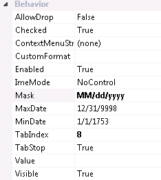
This property is what is used for the MTB data entry. You can populate the mask yourself or if nothing is set, the component will build the mask from the Regional Date Short Date format you have set in Windows. The component will also figure the date separator character from the Mask used.
While the user is entering the date, the component will validate the information entered for each section (month, day, and year) and will not permit the user to continue if the date is not valid. So assuming a mask of MM/dd/yyyy, if the user enters 62 when they enter the control, as soon as the cursor moves off the month part of the mask, 62 is found invalid and the user is given a ping sound and not permitted to enter more of the date. This holds true for dates like Feb 29 on a non leap-year.
The following keys will work in the input area:
- DELETE - Will empty the value (null if you like and this is considered a valid date). This will also set the
DateTimePickerCheckedstate totrue. - ESCAPE - Will revert the field to the value it contained when the user entered it. (If the original date was June 3 1998 and the user entered part of a new date or a full new date and then hit Escape, the value goes back to June 3 1998).
- ARROW keys, END, and HOME keys - Used to move around in the entry area.
- BACKSPACE - Works as backspace.
- Date Separator (usually "/" or "-" but can be any symbol in the mask) - used to separate the sections of the date.
- SPACE - Acts as a date separator.
The component will automatically move to the next section of the date if the mask is filled and the date is validated. So with a mask of "MM/dd/yyyy", a user can enter June 13 1998 as "06/13/1998" or "06131998" or "6/13/1998" or "6/131998" (keep in mind the user can replace the "/" with <SPACE> in any of these as well).
The final work was the pop-out calendar.... I was not able to tell if the user canceled out or picked a date, so I track the original date going in and check it against the value coming out. If the user enters a new date, the info is sent to the MTB and if they escape out, nothing happens with the MTB.
Being so new to .NET development, I am hoping that others out there with more experience will show me better ways to make the new component. I would love to learn more. I realize that a lot of the code could have been written better, so if you make improvements, I would like to know what you did, how it improved the component, and if I can post the update here for others.
Thank you and enjoy this "nullable" DateTimePicker.
 "
"